


WORK DONE
Research and Analysis: Research was conducted on the company, its objectives, as well as analysis of the target audience and competitors to identify key features and needs.
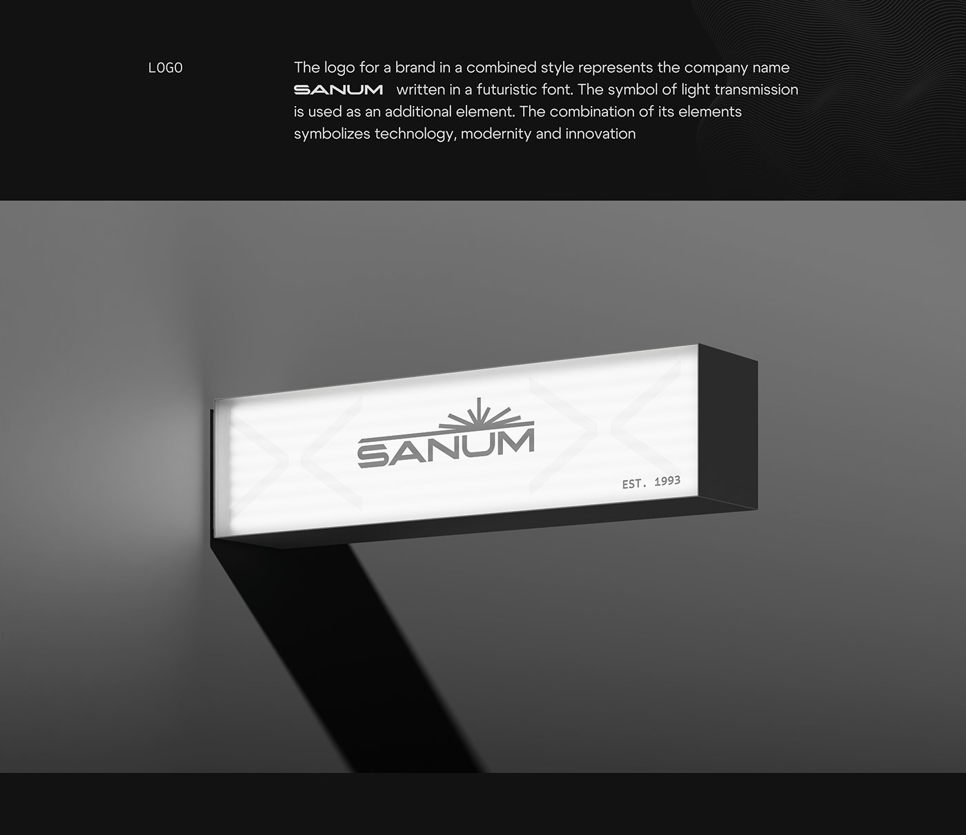
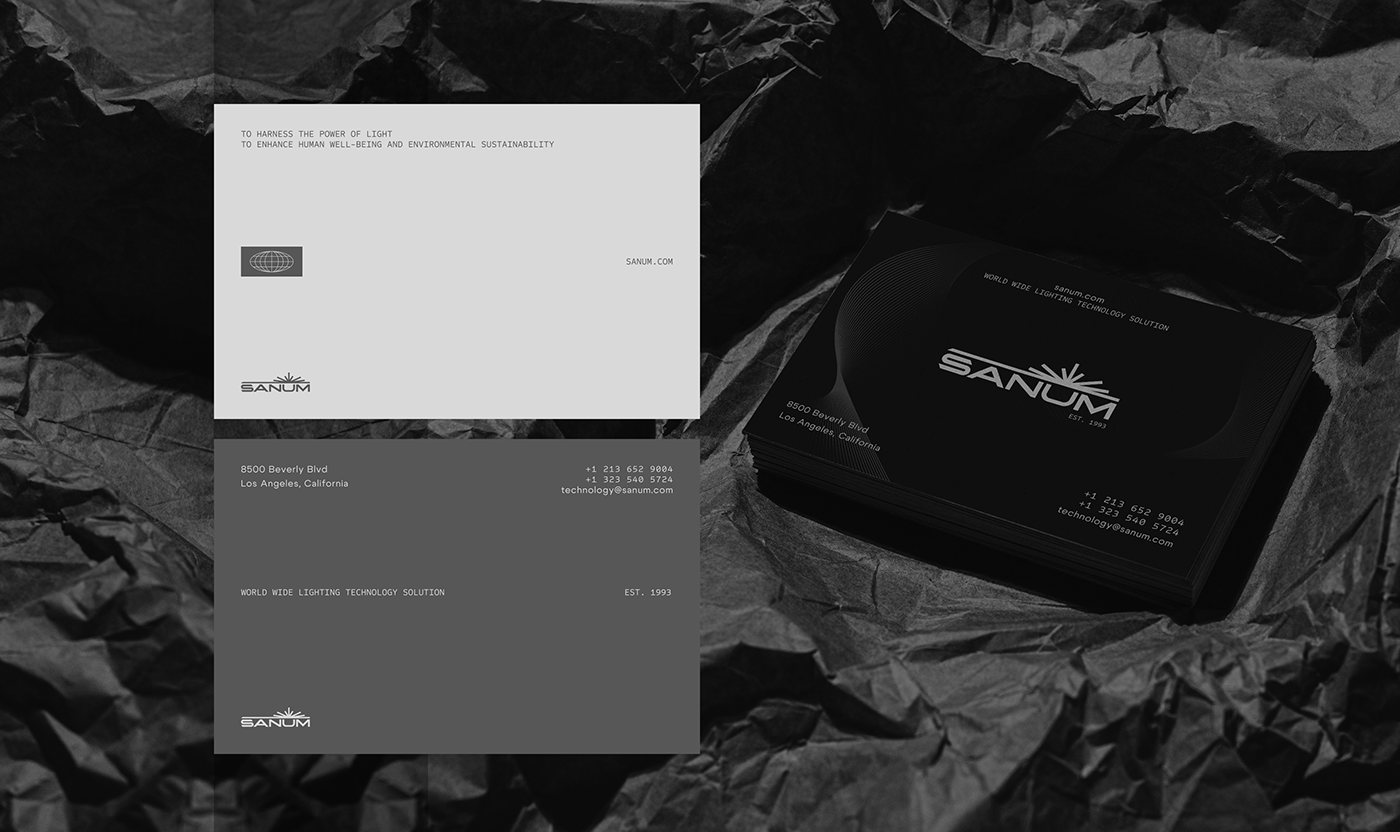
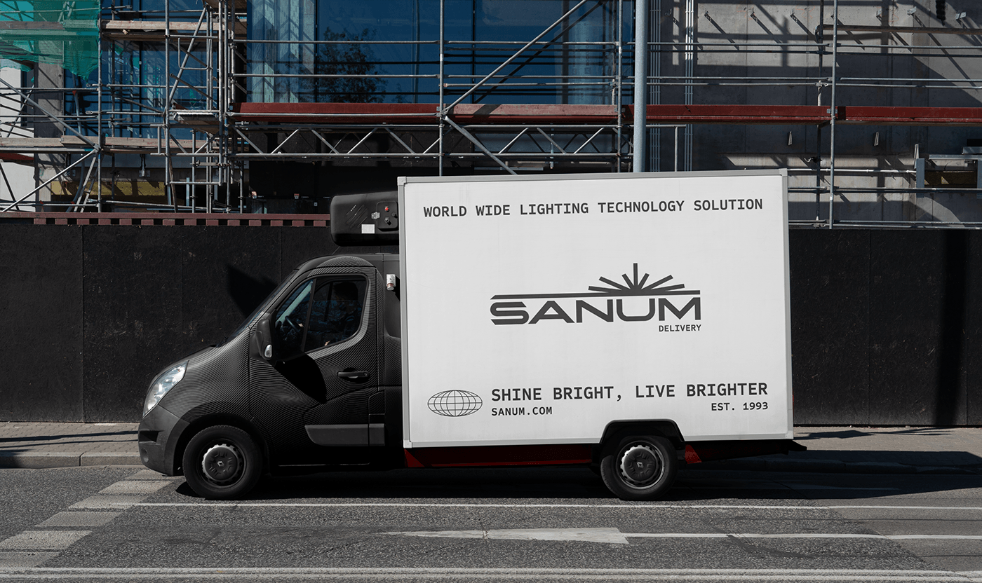
Logo Design: The Sanum logo was created to reflect the company's identity and values, ensuring easy recognizability and readability.
Color palette selection: The company colors were determined: Shadow Mountain (#575757), Pastel Gainsboro (#D9D9D9), Dark Tone Ink Color (#121212), Pure White (#FFFFFFFF) corresponding to the company values and color psychology.
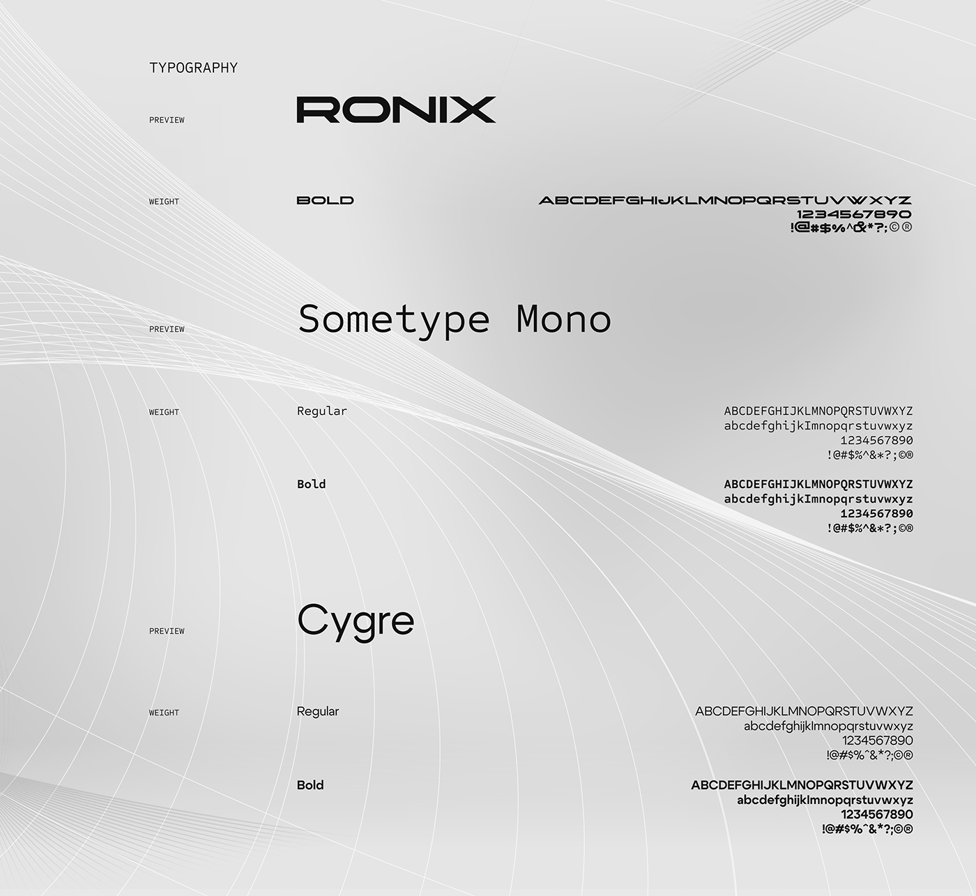
Development of typography: Fonts were chosen to match the overall style of the brand and ensure readability and recognizability.
Creating graphic elements: Graphic elements such as textural or abstract elements were developed, as well as elements associated with the product to complement and embellish the brand design.
Branding: The corporate identity was applied to various media, social media, promotional materials, product packaging, corporate documents and others. This included the use of logo, color palette, fonts and other brand elements in accordance with the company's brandbook. The visual identity was maintained in both digita and print formats to ensure a consistent and recognizable brand image across all platforms.
Brandbook Development: A brandbook was created containing all rules and standards for the use of corporate identity, including logo, colors, fonts and other brand elements.


Copyright (©) 2024 Nikita Ivanenko. All rights reserved


